


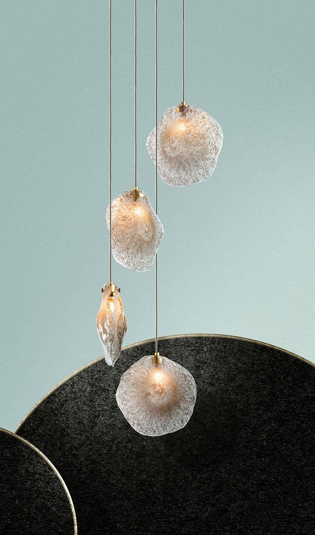


Glass color is one of the few lighting decisions that change a room both day and night. Unlit, a colored fixture reads as an object with its own tone; lit, it filters the light that falls on every surface around it. This guide explains how different glass tones affect warmth and mood, how glass color interacts with LED light, how to mix colors within one composition, and how to choose a palette that works with the materials already in the room.
Quick Answer
Colored hand-blown glass shapes mood in two ways: it gives the fixture a visible tone when it is off, and it tints and softens the light when it is on. Amber and gold tones warm a room and suit dining rooms, libraries, and evening spaces. Clear glass adds sparkle and keeps light bright. Frosted glass diffuses evenly. Gray and black add graphic contrast. The main tradeoff is brightness: darker glass passes less light, so deeply colored fixtures work best as mood pieces within a layered lighting plan.
Key Takeaways
-
Every color has two lives. Judge a glass tone both unlit in daylight and lit at night, because it reads differently in each.
-
Warmth is physical. Amber glass genuinely shifts transmitted light toward warmer tones, which changes how skin, wood, and stone look.
-
The bulb and the glass work as a pair. Warm LED light through amber glass deepens the effect; cooler light through gray reads crisper and more graphic.
-
Mixing colors adds depth. Tonal gradients and contrast mixes make large compositions feel layered rather than flat.
-
Let the room choose the palette. Wood, stone, metal, and textiles already set a color temperature; the glass should answer them.
Color Lives in Two States
When a fixture is off, you see color by reflected light. The glass picks up daylight, shows its tone and texture, and behaves like a colored object in the room. Clear glass takes on the colors around it, while amber, gray, and black read as solid presences.
When the fixture is on, you see color by transmitted light. The light source sits behind or inside the glass, so the glass filters what reaches your eye and the room. A tone that looked subtle in daylight can become rich and saturated at night, and a dark glass that looked heavy can turn into a soft, low glow.
That double life is why color should be reviewed under both conditions. A palette chosen only from a lit photograph can feel unexpectedly dark or busy at noon.
What Each Glass Tone Does to a Room
The table below is a starting point rather than a rule. Thickness, texture, and the way each piece was blown all affect how a particular color behaves.
|
Glass Tone |
Unlit, in Daylight |
Lit, at Night |
Mood and Typical Use |
|
Clear |
Takes on surrounding colors; sparkles in sunlight |
Brightest; crisp highlights and reflections |
Open and airy; bright rooms and views |
|
Frosted |
Soft, even white surface |
Diffused glow with little glare |
Calm and gallery-like; bedrooms and lounges |
|
Amber, light to dark |
Honey to deep tea tones |
Warm, lower-intensity light |
Intimate; dining rooms, libraries, bars |
|
Gray |
Cool, smoky and graphic |
Subdued, softer light |
Modern interiors with steel, concrete or stone |
|
Black |
Strong graphic accent |
Defines silhouette more than it glows |
Contrast within a mixed composition |
|
Gold |
Metallic warmth |
Reflective glints and warm sparkle |
Celebratory; foyers and hospitality |
Warmth Is Physical, Not Just Symbolic
Amber glass does more than suggest warmth. Colored glass absorbs part of the light passing through it, and amber holds back more of the cooler, bluer part of the spectrum. The light that reaches the room is shifted toward gold, which flatters skin, deepens wood grain, and makes stone feel less cold.
The effect is strongest in the evening, when the fixture is a main light source. A room with amber glass can feel noticeably more relaxed than the same room under clear glass, even at similar brightness. We explore this effect in detail in our article on how smoky amber glass changes how warm a room feels.
The Bulb and the Glass Work Together
Glass color never acts alone. It filters whatever light is behind it, so the LED source's color temperature changes the result. Warm-white light through amber glass produces a deep, candle-like glow. Cooler light through gray glass reads crisp and architectural. The same glass can feel quite different with a different source.
Dimming adds a third variable. Shakúff fixtures are LED and dimmable, and lowering the output tends to make colored glass read richer and more atmospheric. If you are still choosing light sources, our guide to choosing bulbs for glass fixtures covers color temperature, dimming, and glow. For a neutral explanation of how LED color temperature works, the U.S. Department of Energy's guide to LED basics is a reliable reference.
Mixing Colors Within One Composition
Multi-pendant fixtures open up a possibility that single shades cannot: a palette. Mixing tones creates depth, guides the eye, and lets one fixture relate to several materials at once.
|
Mixing Strategy |
Visual Effect |
Example |
|
Single tone |
Calm, unified mass |
An all-frosted or all-amber composition |
|
Tonal gradient |
Depth and movement within one color family |
Clear, light amber and dark amber together |
|
Contrast mix |
Energy and graphic rhythm |
Clear and gold set against black or gray |
|
Custom color |
Ties the fixture to a brand or design concept |
A bespoke hue developed for one project |
In a Connecticut dining room under a 20-foot ceiling, 420 pendants combine frosted Nimbus glass with clear, light amber and dark amber Crystal Rock. The gradient gives the composition depth from every seat at the table. In a Brooklyn corporate office, a 40-pendant Kadur Drizzle cluster mixes clear, gold, black, amber, and gray, while a pair of chandeliers nearby introduces a bespoke blue alongside clear, amber, and gray.
Let the Room's Materials Pick the Palette
Every interior already has a color temperature, set by its wood, stone, metal, plaster, and textiles. Glass that answers those materials feels integrated; glass that ignores them feels applied.
At the Truckee Residence in California, a 60-pendant chandelier through a three-floor stairway mixes amber, gray, and black Drizzle glass. The warm tones answer the wood ceiling while the cooler tones pick up the grays of the steps and structure. The fixture bridges the two material palettes rather than choosing one.
The same thinking applies to metal finishes, which sit right beside the glass. Our practical guide to choosing glass color and finish walks through the combinations step by step.
See the Color Before It Is Made
Glass color is hard to judge from a screen. If color will decide whether a fixture works in your room, see it in person first: at Shakúff's showroom in Industry City, Brooklyn, through a partner showroom, or with samples sent to the site so you can hold them against your materials.
Custom Color for Brand and Hospitality Spaces
In commercial interiors, color can carry identity. For the JFK Capital One Lounge, developed with Gensler and the Capital One design team, 600 hand-blown crystal rock pendants were made in custom Pantone colors, South Peak, Long Weekend, and Brown Accent, while the bar chandelier pairs custom frosted glass with brushed brass.
Custom hues are a larger commitment than choosing from an existing palette, so they are best raised early in a project. The payoff is a fixture whose color belongs to that space alone.
Variation Is Part of the Palette
Hand-blown color is never perfectly uniform. Because each piece is hand-made, glass naturally varies in size, color, shape, and texture, and you may see bubbles, fissures, crackling, and crazing. In colored glass, those variations show up as subtle shifts of depth within a single tone.
Across a composition, that variation is an asset. It makes a single-color fixture feel alive and helps a mixed palette blend rather than read as separate blocks. The small air pockets known as seeds are a good example, as we explain in why hand-blown glass seeds are a sign of quality.
Where Color Fits in the Process
Color decisions happen during the drawing stage, alongside canopy size and shape, pendant count, and finishes. Shakúff presents customized drawings with a quote, and drawings are free. Every pendant color costs the same, so you can choose based on design alone.
Many collections, such as the Kadur Drizzle pendant, can be mixed and matched across colors, finishes, and sizes depending on the collection. Fabrication and assembly take place in Brooklyn, typically within 10 to 14 weeks for custom work.
Choose the Color the Room Is Asking For
The right glass color makes a room feel warmer, calmer, or more vivid before anyone notices why. Shakúff can help you develop a hand-blown glass palette around your materials, light, and mood, then show it in drawings before the glass is made.
Start a conversation about color with Shakúff
Frequently Asked Questions
Does colored glass make a fixture less bright?
Yes, darker tones pass less light than clear or frosted glass. Amber, gray, and black fixtures read as mood pieces rather than primary task lighting. Plan supporting light elsewhere in the room, or mix lighter and darker tones within one composition to balance atmosphere with useful brightness.
Will every pendant in a color be identical?
No. Hand-blown glass naturally varies in size, color, shape and texture, so pendants in the same color show slight differences in depth and tone. Across a composition, those differences add richness to the fixture. If an exact match matters, review samples in person before approving the design.
Can Shakúff create a custom glass color?
We've developed custom colors for specific projects, including a bespoke blue for a Brooklyn office and custom Pantone colors for the JFK Capital One Lounge. Feasibility depends on the project, so raise custom color early in the Discovery conversation.
Does glass color affect the price?
Not at Shakúff. Every pendant color is priced the same, so you can choose clear, frosted, amber, gray, or a mixed palette on design merit alone. Price is driven by the size of the fixture, the number of pendants, the canopy, and the finishes.
Should I choose clear or amber glass for a dining room?
Choose amber if the room is used mainly in the evening and you want warmth and intimacy. Choose clear if the room gets strong daylight or you want sparkle and brightness. A mix of clear and amber often works well, giving warmth at night and lightness by day.